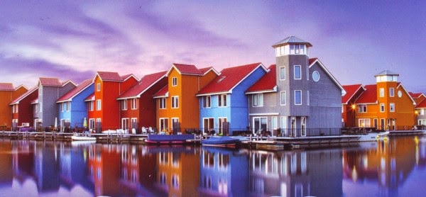
I loooovvveeed the inspiration photo from
Archiscraps for May 2014. The colours were so warm, and I loved the clouds and the reflections in the water. I wanted to capture all that in my page. I started out creating graphics of the little houses, but didn' end up using this in the end.
Stripey Cloud Day occurs in Autumn for about 2 full days. I don't know what causes it. But full bands of clouds stretch across the sky with about twenty bands together, creating a stripey cloud effect. By the second day they fade, and then totally disperse and you can't see any hint of them any more. Year after year of living in my current home I have experienced Stripey Cloud Day. I almost missed it this year as the first day was totally overcast.
(see my step by step below)
 |
| Archiscraps May 2014 challenge inspiration - gorgeous |
HOW DID I CREATE THIS PAGE?
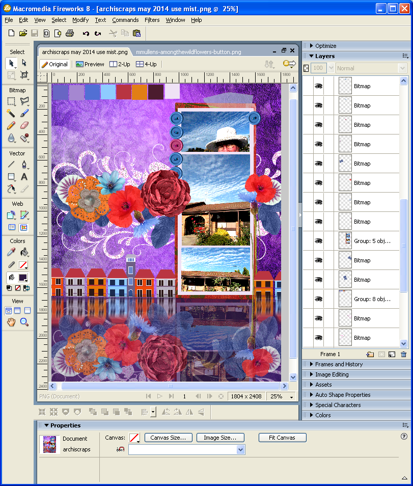
And here's how I created the page step by step (using Adobe Fireworks). Lots of people keep asking me how I create digi pages freehand like I do - without templates. So here it is! (click on the pictures and you'll go into the picture viewer - a bit easier to see) I should point out at this point, that the construction of the page can take a few hours to a few days, depending on where I get stuck or when I am unhappy with the page. Sometimes it just all comes together; but sometimes it does not.
 |
| I copy in the inspiration photo. I then create my own little palette of the colours I like best in the picture, or the ones that stand out for me, remembering there are actually hundreds of colours in there. I create a little tower inspired by the tower in the pic that I may be able to use later. |
 |
| I have a few shots at the background - first blue, and then settle on purple. I leave the inspiration picture and palette up so I can see them and match items to them. I bring in my photos. These were photos I thought would go well with the palette because they don't have alot of white in them. |
 |
| I bring in another photo so that there are three now - two landscape and one portrait in the middle. I extend the frame I have chosen so it stretches over all three photos. I have created some little houses and coloured them like the ones in the pic to see if that will work on the page. I also create my first 'reflection' by mirroring the photo block and then using the transparency of that layer to make it see-thru. |
 |
| I feel the row of houses are too high, and too high to throw a reflection in my 'water'. I decide to bring in flowers for that area instead. At first, they look exactly like they do when I bring them in. |
 |
| I edit the flowers by dragging them over my palette and changing their colours to match. Then I re-arrange them on a loose line. I put swirls in behind in purple. I move the row of houses to the bottom. I create a vertical mirror on the flowers and houses to 'reflect' them into the water. To break the harsh lines on the houses reflection I also turn on a motion blur. It is now that I step back and look at the overall feel of my layout. Is it a little too dark? Is it a little too busy? |
 |
| I change the swirls behind the flowers to white. This will match in the with border around the photos and make the layout a little lighter. I decide the layout is too busy and remove the houses and their reflection. I also now hide the inspiration picture - I don't need it anymore. I need to look at my layout now and decide how to finish it off and what it needs for me to be happy with it. |
 |
| I put a border mask around the layout. This helps frame it and drag my eyes in towards the layout. It's black. I also create my title freehand using different fonts and circles inside the program. I pull in some buttons, but I am not sure exactly where to put them. I re-colour them towards those already in the layout. |
 |
| I feel the layout needs some magic at this point. It needs to lighten still a bit, and needs something like birds or clouds and a bit more texture and misting to finish it off.I have added a black lacey journal block in behind the photo frame. Any other colour is too stark. |
 |
I change the masking border on the page to white. I add clouds to the top background. I add a few flying birds in white, and a black swan down on the water level to make it look more like water than a shiny table top. I add purple mist in behind the flowers and swirls to make them pop more, and white misting paint to give it a magic quality. I also adjust the colours in the title, move the buttons to their final location, and add some wee flowers to the top of the page for balance. I save the document and then export it out as a PNG file so that no one else can access the layers I have created. The exported file is 'flat'. And that's it. All done!
(except my ingredients list of what I used - still need to do that - I feel I owe it to the creators of the marvelous kits and elements to credit them accordingly!) |


Wow! What a gorgeous layout! Love how you created the reflection... and used so many colors from the inspiration photo! Awesome!!! Thanks for playing along with us at Archi scraps! :)
ReplyDeleteKylie, this is stunning! While I don't understand digi scrapping I can tell you have gone to so much work.I've noticed clouds like that but didn't realise they were a phenomenon.Thanks for joining in at Archiscraps.
ReplyDeleteI also don't have a clue about digital scrapbooking, but how amazing do those colours look. Gorgeous LO and thank you for joining us at Archiscraps.
ReplyDeleteI like how you picked up the purple of the sky. I wouldn't have thought of that. Well done.
ReplyDeleteGorgeous colours,thanks for playing along at Archi-scraps
ReplyDelete